25 Jan 5 Features Your Website Must Have to Attract Buyers
Before the pandemic, most business owners had a website only to be used as a window to their business. Now, a website needs to be more than that; it needs to turn website traffic into paying customers. The increase in web users during the COVID crisis shows their buying decisions are primarily based on using online resources, so how do you make sure you grab their attention?
In this short piece, I have gathered the top 5 features that have been tested and proven to be a success for our clients.
1.) Mobile Responsive Design
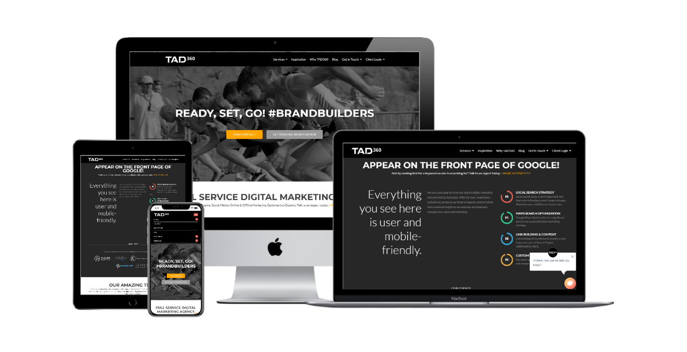
The worldwide use of mobile internet and smartphone users since 2012 has grown rapidly and does not show any sign of stopping soon. As a response to this statistic, Google has in fact informed web designers such as TAD360 back in February 2015, that their response to this growing number of mobile device users was to update their existing search engine algorithm to favour websites that are mobile-friendly over traditional websites.
2.) An Obvious and Clear use of Call to Action Buttons
Call to action buttons are a way to get those who are interested, converted! The best way to make prospects take that final decision to become a customer is an enticing prompt. Contrasting colours, exciting/actionable wording and placement are just some of the factors that need to be considered when adding call to action buttons on your website. This is also of high importance when your website has a lot of information to digest; it guides the user to the next stage in the progress, ensuring they complete a purchase, a sign-up or appointment etc.

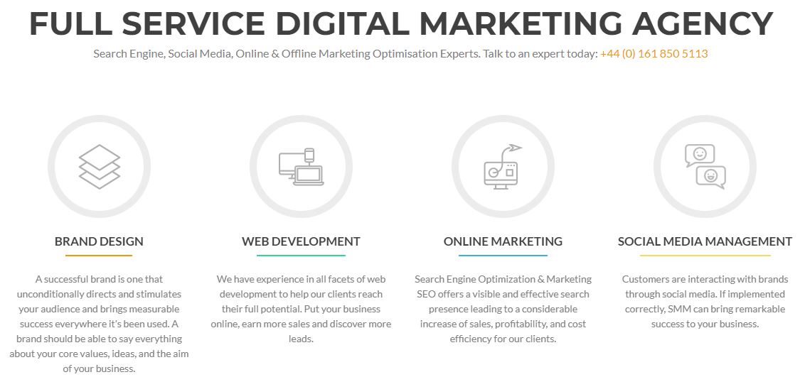
1.1 example of a clear call to action.
3.) A Unique Value Proposition
If you could describe – in one or two sentences; the value of your business and why people choose to buy from you… could you? Well, that is your UVP in a nutshell! A UVP must achieve the following:
- it must attract the prospect’s attention (offer a spectacular solution to a problem),
- it must be simple to comprehend (people should be able to grasp what your business provides quickly),
- it must be attractive enough to convert the prospect (are there any benefits or discounts?), and
- it must make you stand out from the rest (how are you different from the others out there, what’s special about you?).
4.) Strategic Content Placement (No one likes a cluttered website)
Allow your website to tell a story of your business: why and how it began, who/what formed it, what skills you have to in order to perform, and what you now offer in terms of products-services. Allow your website to flow cohesively, from start to finish in order to paint a picture to your target prospects that you are the best choice for them. Make sure you understand your audience and their behaviours; only then you can display targeted content they will appreciate and might not even realise they needed. This is an assured way to increase website conversions and retain customers. Use your blog or article page to narrate a story or case studies that solve a problem, all this content goes a long way in helping your readers see the value and build trust with your brand.
In cases where you have too much information to share, break it down into segments starting from the main content suitable for all your audiences. Then, break down the content into categories by using infographics and other graphical content to convey your message to individual audiences. You can also keep lengthy documents as downloadable content. Your visitors can willingly give you their email in return for your valuable content.

Fig 1.2 Example of website content segmentation
5.) Testimonials
Envision this: a prospect enters a website because they are interested in certain products/services. They read through each section and are impressed with the feel of the business and what is offered. There may even be a promotional offer included with first purchase. Reaching the ‘find out more’, ‘book today’ or ‘checkout’ section, the prospect stops. There are no testimonials. The prospect then exits the website or holds off to a later date. See how crucial testimonials can be in the conversion process? They provide credibility to your business, they prove how trustworthy you can be delivering a product/service and provide real evidence of the quality your business provides.

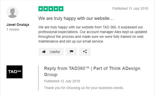
Fg 1.3 example of testimonials
In conclusion, less is more.
You only have 3 seconds to make a first impression on your website, make it count.
We’ve shared our 5 must-have website features, did we miss anything or is there something you would like to add? Let’s hear your thoughts in the comment area below.


